 intactworks-…-color-light.svg
Things that hold together, built properly.
The Intact Works brand: the mark, the colours, the type and the motion, and the files to use them. Light and dark are both first-class; everything here works in either.
The idea
“Intact” means whole and unbroken; “Works” is a workshop, and it works. Everything the brand draws follows from that.
The products are open arcs; the company is the closed line.
Every Intact Apps mark is a graphite tile with an open arc and one glyph in the app’s colour. The company mark is one unbroken stroke that closes: up the I, along the chord, down and up through the W, and back into the chord. Beside the apps it sits on the same tile, in white, with no colour of its own.

Two themes, one inspection.
Dye-penetrant inspection is how a part is proved to be intact: a red dye shows any crack against a chalk-white developer, or, in the fluorescent method, glows in a dark booth under a UV lamp. The light theme is the first, the dark theme the second. Same red, different light.
Logo
One mark drawn as one unbroken stroke, and the name set in Geologica. Use the files in brand/logo/; never redraw the mark or retype the name.
The mark
Drawn on the 64-unit grid of the Intact Apps tiles with the same stroke weight as their arcs, so it sits with them at the same visual weight.
- Grid
- 64 × 64 units, the Intact Apps tile grid
- Stroke
- 6 units, round caps and joins (small cut: 7.5)
- Drawn area
- 53 × 42 units, centred on the grid
- Path
- 1 → 2 up the I · 2 → 3 along the chord · 3 → 7 down and up through the W, closing into the chord at 7
- Motion
- The site draws this path as one stroke in 950 ms,
ease-in-out - Colour
- Always one colour
- Files
- Filled outlines in every logo file;
intactworks-mark-stroke.svgkeeps the stroke for animation
Two cuts
At 24 px and below use the small cut: heavier, and wider, so the I and the W stay apart. Favicons, the app switcher and browser tabs use it.
Lockups
Horizontal is the default. Mark height is 1.4 × the cap height of the name, with 0.55 × cap height between them; the stacked mark is 2.4 × cap height.
Horizontal · lightThe default
Horizontal · darkThe default

Stacked · lightSquare and tall spaces: avatars, title slides, merchandise
Stacked · darkSquare and tall spaces: avatars, title slides, merchandise
Mark · lightWhen the name is already present, or space is very small

Mark · darkWhen the name is already present, or space is very small

Wordmark · lightWhere the mark would repeat nearby

Wordmark · darkWhere the mark would repeat nearby

Colour versions
Each layout comes in full colour, one-colour black and one-colour white, each with a light-theme and a dark-theme file. The one-colour versions use each theme’s own darkest and lightest colours, so a logo always matches the text around it.
Light themeDark themeintactworks-…-color-light.svgintactworks-…-color-dark.svg intactworks-…-black-light.svg
 intactworks-…-black-dark.svg
 intactworks-…-white-light.svg
 intactworks-…-white-dark.svg
Full colour
mark in Penetrant, name in ink
mark in Penetrant, name in ink
intactworks-…-color-light.svgintactworks-…-color-dark.svgOne colour, black
the theme's darkest: #14171D / #171A20
the theme's darkest: #14171D / #171A20
intactworks-…-black-light.svgintactworks-…-black-dark.svgOne colour, white
the theme's lightest: #FFFFFF / #F1EEF5
the theme's lightest: #FFFFFF / #F1EEF5
intactworks-…-white-light.svgintactworks-…-white-dark.svgClear space and minimum size
Keep c clear on every side. For lockups, c is the cap height of the name; for the mark alone, half its drawn height.


Don’t
The mark is a single drawn line in one colour. Anything that changes the line or the colour makes it someone else’s.
Intact Works
Beside the Intact Apps
In the apps’ switcher the company icon sits on the family’s graphite tile: present, and quiet. It is the only tile without a coloured glyph. Use intactworks-app-tile.svg up to 32 px and intactworks-app-tile-large.svg above.
 Intact Worksintactworks.com
NDT Intactinspection reports
NDT Intervalthickness monitoring
NDT Insonifyscan planning
NDT Inferinspection reliability
Intact Worksintactworks.comNDT Intactinspection reports
NDT Intervalthickness monitoring
NDT Insonifyscan planning
NDT Inferinspection reliability
Writing the name
Two words, capital I and capital W, in every language. In Russian and Kazakh text the name stays in Latin letters, in the language’s quotation marks where the legal form needs them.
Write
- Intact Works
- ТОО «Intact Works»
- Intact Works LLP
Never
- IntactWorks
- INTACT WORKS
- Intact works
- INTACT
RussianТоварищество с ограниченной ответственностью «Intact Works» · ТОО «Intact Works»
Kazakh«Intact Works» жауапкершілігі шектеулі серіктестігі · «Intact Works» ЖШС
EnglishIntact Works LLP
Colour
Penetrant: the colours of dye-penetrant inspection. Light and dark are designed together from the same named hues; dark is never inverted light.
Light theme · visible penetrant
Red dye on chalk-white developer, carbon-steel ink.
Developerground
#F2F3F0 · RGB 242 243 240
every ratio is measured on this
#F2F3F0 · RGB 242 243 240
every ratio is measured on this
Developer, raisedraised surface
#FFFFFF · RGB 255 255 255
a step up from the ground
#FFFFFF · RGB 255 255 255
a step up from the ground
Carbontext
#14171D · RGB 20 23 29
16.1 on ground
#14171D · RGB 20 23 29
16.1 on ground
Steelmuted text
#575E68 · RGB 87 94 104
5.9 on ground
#575E68 · RGB 87 94 104
5.9 on ground
Aa 6.0
Penetrantaccent
#C4122F · RGB 196 18 47
5.4 on ground
#C4122F · RGB 196 18 47
5.4 on ground
UVsecondary, glow
#6536C8 · RGB 101 54 200
6.5 on ground
#6536C8 · RGB 101 54 200
6.5 on ground
Passsuccess
#1D7347 · RGB 29 115 71
5.2 on ground
#1D7347 · RGB 29 115 71
5.2 on ground
Holdattention
#9A5800 · RGB 154 88 0
5.0 on ground
#9A5800 · RGB 154 88 0
5.0 on ground
Developer 60%Developer, raised 14%Carbon 15%Steel 7%Penetrant 3%UV 1%
Also: alternate ground #E9EBE7 · line #D8DBDE · control border #7B828B · hover #A50E27
Dark theme · the booth
The darkened inspection booth, violet-black under the UV lamp; the same red, lifted.
Boothground
#171A20 · RGB 23 26 32
every ratio is measured on this
#171A20 · RGB 23 26 32
every ratio is measured on this
Booth, raisedraised surface
#20252D · RGB 32 37 45
a step up from the ground
#20252D · RGB 32 37 45
a step up from the ground
Developertext
#F1EEF5 · RGB 241 238 245
15.2 on ground
#F1EEF5 · RGB 241 238 245
15.2 on ground
Steelmuted text
#AAB2BF · RGB 170 178 191
8.2 on ground
#AAB2BF · RGB 170 178 191
8.2 on ground
Aa 5.6
Penetrantaccent
#FF5470 · RGB 255 84 112
5.6 on ground
#FF5470 · RGB 255 84 112
5.6 on ground
UVsecondary, glow
#AE8CFF · RGB 174 140 255
6.6 on ground
#AE8CFF · RGB 174 140 255
6.6 on ground
Passsuccess
#4FD08E · RGB 79 208 142
8.9 on ground
#4FD08E · RGB 79 208 142
8.9 on ground
Holdattention
#F5B64A · RGB 245 182 74
9.7 on ground
#F5B64A · RGB 245 182 74
9.7 on ground
Booth 60%Booth, raised 14%Developer 15%Steel 7%Penetrant 3%UV 1%
Also: alternate ground #1C2027 · line #353C47 · control border #7B8595 · hover #FF7389
Using it
- Penetrant marks the one thing to do on a screen — the primary button — and the mark. It is never a background for long text and never a decorative wash.
- UV is light, not paint: focus rings, selection and the glow behind the mark in the dark theme. Never body text.
- Errors use Hold with an icon and words. Red is never the only signal.
- Product colours — Intact orange, Interval magenta, Insonify teal, Infer indigo — appear only on product tiles and inside product screenshots.
- Dark is a theme of its own: use the dark tokens, never
filter: invert(). - Every text pair below passes WCAG AA in both themes; body text passes AAA.
In use
Hover, focus and states, side by side. Focus is a UV ring offset from the element, so it shows on red buttons too.
See our workHover
! Write your name, so we know who to answer
✓ Message sent. We’ll reply within one working day.
! Check the email address: it needs an @.
A link in text and selected text.
See our workHover
! Write your name, so we know who to answer
✓ Message sent. We’ll reply within one working day.
! Check the email address: it needs an @.
A link in text and selected text.
Contrast
| Pair | Light | Dark |
|---|---|---|
text on bg | 16.11 AAA | 15.18 AAA |
text on surface | 17.95 AAA | 13.41 AAA |
text on bg-alt | 14.96 AAA | 14.23 AAA |
muted on bg | 5.88 AA | 8.16 AAA |
muted on surface | 6.55 AA | 7.21 AAA |
accent on bg | 5.43 AA | 5.60 AA |
accent on surface | 6.04 AA | 4.95 AA |
on-accent on accent | 6.04 AA | 5.60 AA |
on-accent on accent-hover | 7.80 AAA | 6.69 AA |
secondary on bg | 6.47 AA | 6.63 AA |
success on bg | 5.24 AA | 8.92 AAA |
success on success-soft | 4.99 AA | 6.99 AA |
attention on bg | 5.00 AA | 9.69 AAA |
attention on attention-soft | 4.73 AA | 7.84 AAA |
control on bg | 3.49 AA large / UI | 4.67 AA |
control on surface | 3.88 AA large / UI | 4.13 AA large / UI |
focus on bg | 6.47 AA | 6.63 AA |
WCAG 2 contrast ratio. AA: 4.5 for text, 3 for large text and UI borders. AAA: 7.
Type
Geologica, one family, by Monokrom and Cyreal, under the SIL Open Font License. It covers Latin, Serbian Latin, Russian and Kazakh, and its sharpness axis cuts corners clean at display sizes.
Two axes
Display: weight 640, sharpness 100. Text: weight 400, sharpness 0. Self-hosted WOFF2, subset to Latin, Latin Extended and Cyrillic, with a size-matched Arial fallback so nothing shifts when the font loads.
Weight400 text · 640 display
Works Works
Sharpnessred outline 100 over grey 0
s2 6
Sharpness changes only the terminals: at 100 they end in cut, angled strokes instead of soft ones. A detail you feel at display sizes more than see; text stays at 0.
Scale
Every size is fluid between a 360 px and a 1600 px wide screen. Body text never runs wider than 68ch.
Software, websites, support.
Серверы и хостинг
We run what we build
Сайты и интернет-магазины
Design and branding
Делаем программы, сайты и системы за ними — и поддерживаем их работу.
Intact Works is an IT company founded in 2026. We build software and websites, look after servers and advertising, and make our own products: Intact Apps, NDT Inspect and Klik za Termin.
Отвечаем в течение рабочего дня. Пишем на русском, английском и сербском.
ТОО «Intact Works» · Intact Works LLP · «Intact Works» ЖШС
Scripts
Latin
We build software, websites and the systems behind them.
ABCDEFGHIJKLMNOPQRSTUVWXYZ
abcdefghijklmnopqrstuvwxyz
0123456789 & @ — « » “ ”
Serbian Latin
Klik za Termin — zakažite termin za par sekundi.
Š Đ Č Ć Ž š đ č ć ž
Šabac · Đurđevdan · Čačak · Niš
Russian
Делаем программы, сайты и системы за ними.
АБВГДЕЁЖЗИЙКЛМНОПРСТУФХЦЧШЩЪЫЬЭЮЯ
абвгдеёжзийклмнопрстуфхцчшщъыьэюя
Kazakh
«Intact Works» жауапкершілігі шектеулі серіктестігі
Ә Ғ Қ Ң Ө Ұ Ү Һ І
ә ғ қ ң ө ұ ү һ і
Rules
- Sentence case everywhere, headlines included.
- No tracked-out capital labels above headings, and no highlighting one word of a headline in colour or italics.
- Body text at most 68ch wide; display type sets the drama, body type stays plain.
- Russian: a non-breaking space after one- and two-letter words and before a dash, so no line starts with «—» or ends with «и».
- Quotation marks: « » in Russian and Kazakh, “ ” in English, „ ” in Serbian.
- Tabular figures (
font-feature-settings: 'tnum') for prices, tables and requisites.
Motion
The site moves a lot, so it moves as one physical system: the same durations, curves and distances everywhere, and every animation ends in a complete, readable state.
One line, drawing itself
The mark drawing as one stroke is the signature. On load it leads a sequence of at most 1.5 s, once per visit.
Arrive, travel, leave
Ease-out to arrive, ease-in-out to travel under scroll, ease-in to leave. Nothing moves linearly except the marquee.
Always resolved
Nothing ends half-faded, and nothing important is only visible in the middle of an animation.
Transform and opacity only
No layout properties on scroll, one pinned section at a time, a steady 60 fps on a mid-range Android.
Reduced motion is designed
With reduced motion, choreography is off, content is static and complete, the theme switch is instant and the marquee stops.
Works without JavaScript
Content is never hidden behind opacity: 0 unless a .js class is present; animation only enhances.
Curves
Arriving: reveals, slides, cards landing
cubic-bezier(0.16, 1, 0.3, 1)Travelling: the draw, pinned tracks
cubic-bezier(0.65, 0, 0.35, 1)Leaving: exits and dismissals
cubic-bezier(0.7, 0, 0.84, 0)Landing with a 2 % overshoot: stacked cards
linear(0, 0.25 9%, 0.52 18%, 0.74 28%, 0.9 39%, 0.99 51%, 1.02 62%, 1.01 76%, 1)Durations, staggers, distances
--dur-instant90 ms--dur-fast160 ms--dur-base260 ms--dur-slow450 ms--dur-slower700 ms--dur-draw950 ms--dur-hero1500 ms--dur-theme520 ms--stagger-line | 70 ms between lines |
--stagger-item | 90 ms between items |
--stagger-card | 120 ms between cards |
--move-s | 12px |
--move-m | 32px |
--move-l | 80px |
--parallax-s | 4 % of scroll distance |
--parallax-m | 8 % of scroll distance |
--parallax-l | 14 % of scroll distance |
| Headline reveal | starts at 70% of the viewport |
Try them
We build software,websites and thesystems behind them.
Intact AppsFive apps, one sign-in
NDT InspectThe NDT community
Klik za TerminOnline booking in Serbia
Your system asks for reduced motion, so the demos show their final state.
Applications
The brand at the sizes it will actually be seen: a card, a signature, an avatar, a browser tab, a link preview.
Business card · 85 × 55 mmfront light, back dark

Software · websites · support · servers · advertising
DougFounder
Email signatureexport/email-signature.html
Social avatars · 1024 pxcropped to a circle by the platform
Favicon · 16 pxSVG that follows the browser’s scheme; ICO fallback
Intact Works✕
Intact Works✕
ICO and PNG fallback✕
 ICO and PNG fallback
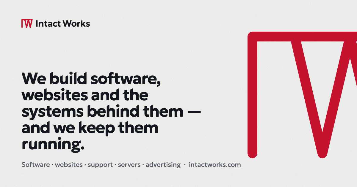
Link preview · lightexport/og-default-light.png · 1200 × 630
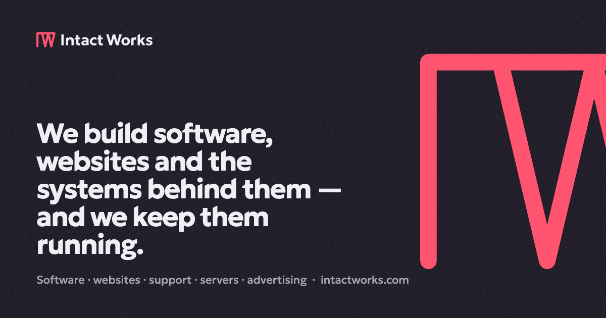
Link preview · darkexport/og-default-dark.png · 1200 × 630
Files
Everything is generated from brand/tokens.source.mjs and brand/logo/src/ by the scripts in tools/.
Logo, SVG
- horizontal: color-light color-dark · black-light black-dark · white-light white-dark
- stacked: color-light color-dark · black-light black-dark · white-light white-dark
- mark: color-light color-dark · black-light black-dark · white-light white-dark
- mark-small: color-light color-dark · black-light black-dark · white-light white-dark
- wordmark: color-light color-dark · black-light black-dark · white-light white-dark
- mark-stroke (animation source) · favicon.svg








Logo, PNG
- Every SVG above at @1x, @2x and @3x on transparent, in export/png/ (the logo pack holds them all)
- For example [email protected]

Icons
- favicon.ico (16, 32, 48) · favicon-32.png
- apple-touch-icon.png · icon-192.png · icon-512.png · icon-512-maskable.png
- App switcher: 24 · 48 · 72 px · SVG




Social
- og-default.png · light · dark · Russian: light · dark
- Avatars: light · dark · Penetrant
- Email signature (HTML)
Code
- tokens.css — colour, type, space, radius, shadow, motion; both themes
- fonts.css — Geologica and its fallback